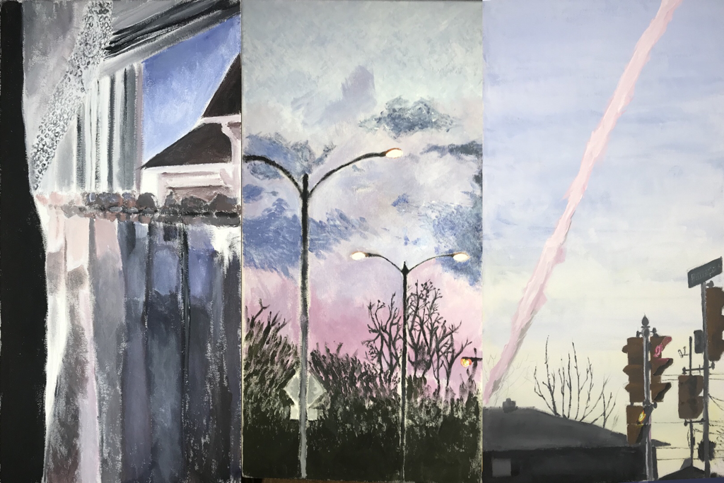
Triptych
|
|
|
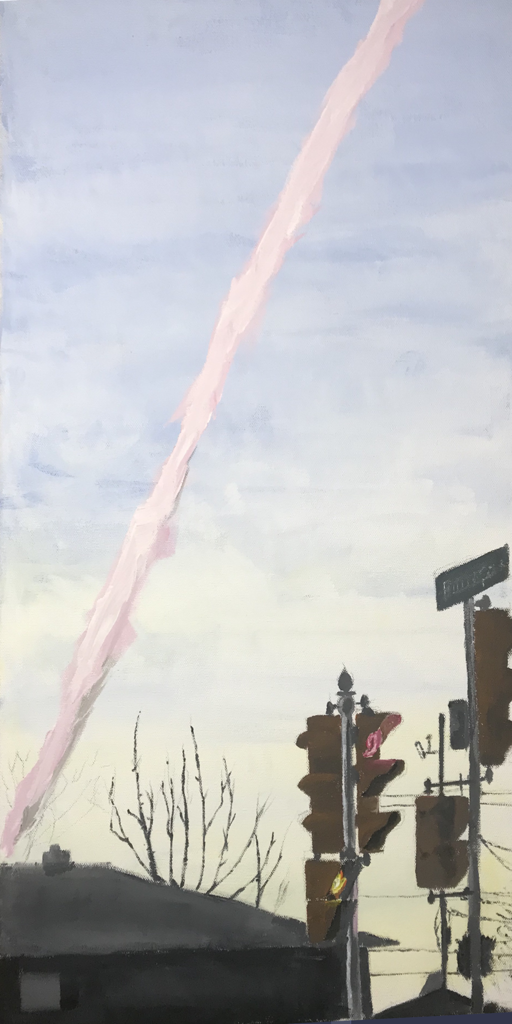
GazeAcrylic paint on canvas
Three 30cm x 61cm canvases December 2019 Exhibition Text: Gaze is inspired by the Impressionism movement. The piece was meant to display a journey in Milwaukee (my hometown) using photos I took. I took inspiration from Monet's brushstroke technique in Woman with a Parasol - Madame Monet and Her Son. |
Planning
InspirationI was inspired by Claude Monet because I was very intrigued by the unity in his compositions and how he correlated it with his Impressionism technique. This piece really struck out to me because of the harmony in the colors and how he was able to create a very sentimental mood from that. Monet was the figurehead of Impressionism alongside other artists such as Edouard Manet, Paul Cezanne, Edgar Degas who focused on the visual experience, the glance. Going beyond realism (the norm in the art world at the time), he used flickering brushstrokes creating an abstract use of rhythm. In Woman with a Parasol - Madame Monet and Her Son, you can see that he used thick flickering brushstrokes in the clouds and thin ones in the grassy plains. His paintings would develop from quick glances into lingering contemplations. This intuition he instilled into his paintings is what made him very unique compared to other artists.
|
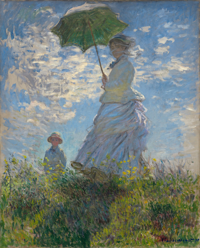
Claude Monet, Woman with a Parasol - Madame Monet and Her Son. (Oil on canvas, 1875)
Courtesy of claudemonetgallery.org
|
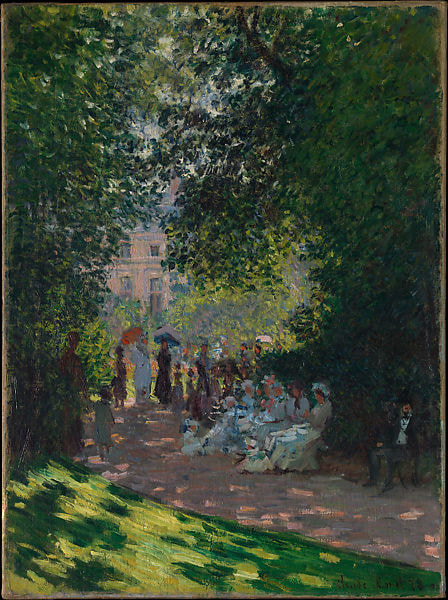
Claude Monet, The Parc Monceau. (Oil on Canvas, 1878) Courtesy of claudemonetgallery.org
|
Though Monet has the artistic maturity to create realism, he focuses more on the feelings that come with art and how the fundamentals can further support the emotions that his art displays. Keeping this mindset in mind, I tried to push further than what the pictures I took look like, but rather express the feelings that come with the "first glance". The brushstrokes also influenced my work when I focused on the objects that were emphasized the most.
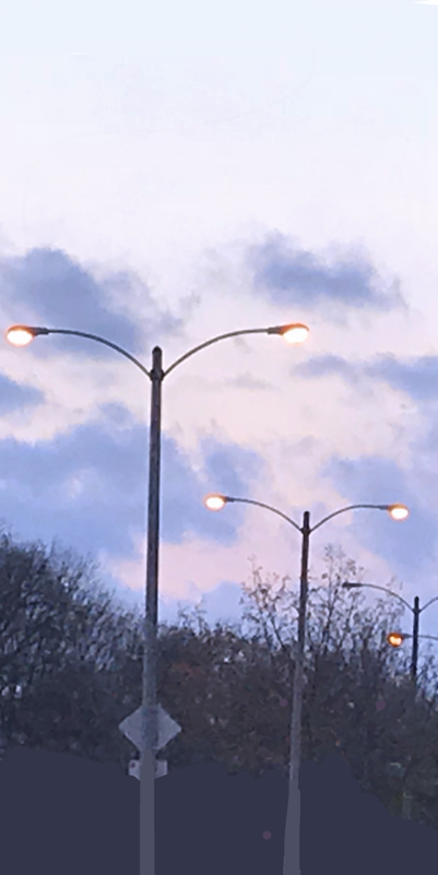
The second piece I took inspiration from was The Parc Monceau by Monet. During this time it was late in Monet's pioneering activity where he just had finished his series, The Gare Saint-Lazare. The composition of this piece was very intriguing to me because the main subject of the piece (the people) were under the shade of the trees. This certain use of unity made it so darker hues would be put into the center of the piece. Overall, the lighter and more saturated hues give this piece a well rounded contrast in terms of tone. |
Planning Sketches
|
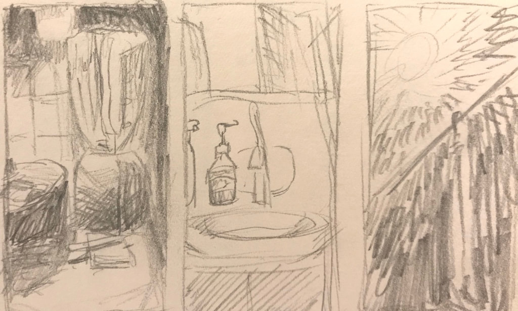
In the first sketch, I referenced 3 pictures I took on my phone around my house. It was going to be inspired by Claude Monet's painting techniques. The hues would not be too saturated to give off the feeling you get when you stare at something for a long time out of anxiety. If I were to make this the finished product, the theme of this sketch would be "out of control".
|
|
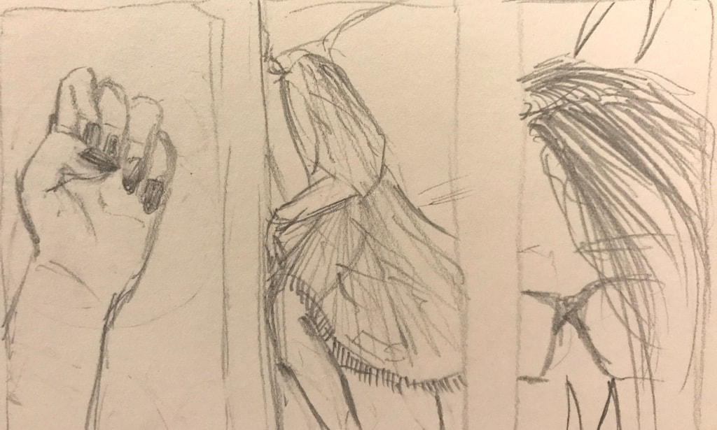
The second sketch is supposed to be 3 things I found interest in in chronological order. It was going to be inspired by Kehinde Wiley's realism and backgrounds. The hues would be very saturated to give off the feeling of how all of these things relate to female stereotypes. If I were to make this the finished product, the theme would be "gender". I'm anticipating to make a piece using this theme later throughout second semester.
|
|
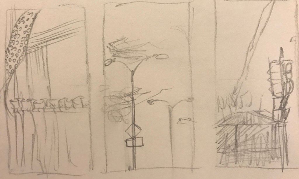
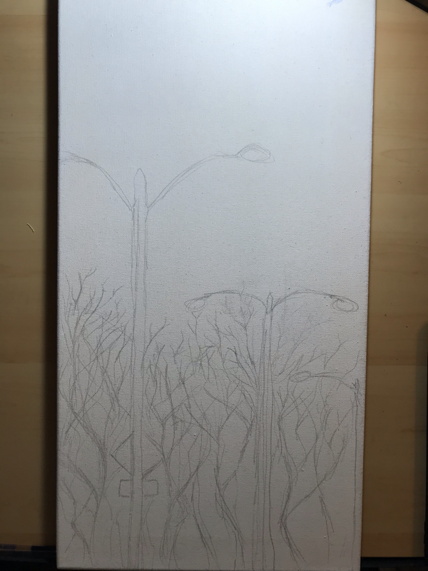
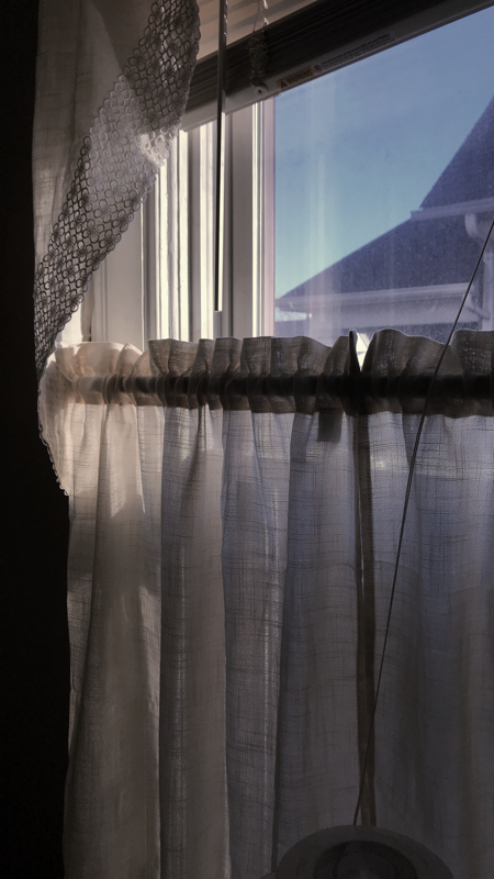
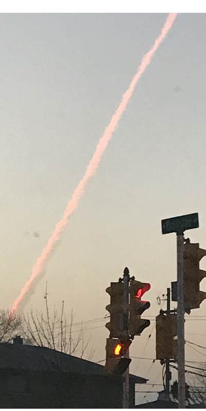
In the final sketch (like the first sketch) I referenced 3 pictures I took on my phone but one was from my house, and the other 2 from around my neighborhood in Milwaukee. I felt like these pictures go well together in terms of telling a story of a day in my hometown. The first panel starting from my house looking outside to a hopeful day. The second panel is the traveling aspect, and the third panel is the final destination.
|
Process
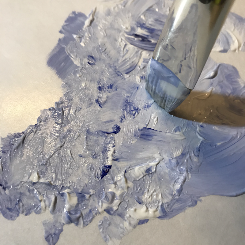
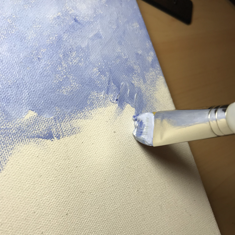
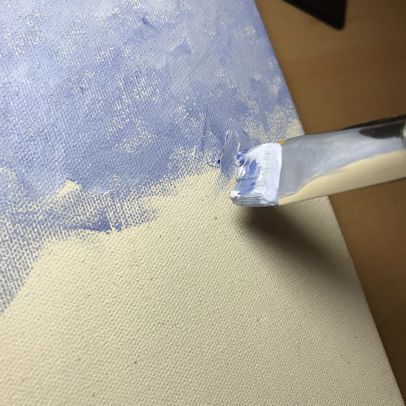
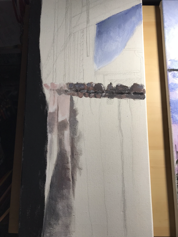
ExperimentationI first started off with the middle panel when beginning with this process. The sky was a gradient from blue to orange red so I experimented with how I would mix the colors. At first I mixed white and yellow to create a lighter yellow so the gradient could go from light blue, to light yellow, to light orange red. But, what I ended up doing was going from light blue, to light violet, to light red. The main reason why I changed the color combination was because I was having trouble making the gradient mix nicely without making a vivid green. I also felt that having violet in the painting created a calm tranquil atmosphere. Another thing I experimented with was not completely mixing the colors so there could be more harmony between the colors. I feel this was good practice so I know what to do to prepare for the other panels when it comes to the colors. The painting did overall look better without having any murky blending, and it was difficult to blend especially since I have minimal experience in painting on canvas cloth and in general.
|
|
|
|
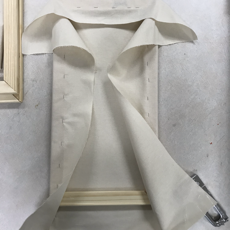
ProcessBefore I started sketching out my ideas, I started stretching the 2 ft by 1 ft canvas. I stapled the sides of the canvas with a staple gun. Afterwards I gessoed the canvas with one coat. Then I started on my planning sketches. After I came up with the idea I made the sketches on the canvases. I started with the middle panel, the first panel, and then the third panel.
With all of the panels I would keep the reference picture on the side on Procreate so I can use the color picker and as I painted I would know what colors to make. I changed the color balance of the pictures before I started so the colors can match between each other. The colors I prepared were red, blue, yellow, white, and black. The white and black helped me dull colors out based on tone when I wanted to change certain colors. Blue was the main color I mixed with white to lighten it. Throughout the whole painting process I strayed away from mixing colors completely to correlate with Monet's style. |


|
I used an array of different hues when I started painting the first panel. The main color I needed was brown. Since I didn't have brown paint with me, I mixed all of the primary colors (red, yellow, blue) to create it. I needed a large amount of brown because the first panel had varying tones of brown whether there were more red or blue. For the most part, I used white to make beige for the curtain and added blue for the bluish glow from the sky.
For the third panel of the triptych, I used the majority of colors I made for the first panel since they are very similar in color scheme regarding the sky, curtain and window seal. Besides that, I had to create green, yellow, and red tones which seem duller to conclude the sequence in a tranquil manner. This was a fun experience because I had grasped a better understanding on how tones could be applied to further develop the atmosphere/environment. The photos below are what I used for reference. They were taken on different days though I felt like connecting them because of their similar color schemes. |
|

Reflection
This project was very difficult for me to complete overall. I have little experience in painting and I have trouble making colors. Even though it wasn't easy, the process was very interesting but I feel like I may have made some mistakes when gessoing my canvases.
|
Similarities-Brushstroke technique. They both utilize a flickering technique which creates repetition.
-Uses movement. The different components of the landscapes help develop the overall movement of the pieces through trees and clouds. Differences-Different saturation of hues when it comes to harmony.
-Color schemes. My triptych utilizes more pink and blue tints and yellow tones while Monet's pieces use saturated blues and greens and contrast it with tones. |
|
ACT Responses
Clearly explain how you are able to identify the cause-effect relationship between your inspiration and its effect on your artwork?
The main reason why I took inspiration from Monet was because of his brushstroke technique and use of color. This impacted the inspiration for the concept of the triptych as well as the technique.
The main reason why I took inspiration from Monet was because of his brushstroke technique and use of color. This impacted the inspiration for the concept of the triptych as well as the technique.
What is the overall approach the author has regarding the topic of your inspiration
The approach the author had regarding my inspiration was Monet's contributions to the Impressionism movement and what his intentions were for his artworks.
The approach the author had regarding my inspiration was Monet's contributions to the Impressionism movement and what his intentions were for his artworks.
What kind of generalizations and conclusions have you discovered about people, ideas, culture, etc, while you researched your inspiration?
I noticed that the culture surrounding Impressionism was very negative because the majority of people didn't think to change the fundamentals in artwork.
I noticed that the culture surrounding Impressionism was very negative because the majority of people didn't think to change the fundamentals in artwork.
What is the central idea or theme around your inspirational research?
Observation and Impressionism is the central idea around my inspirational research.
Observation and Impressionism is the central idea around my inspirational research.
What kind of inferences (conclusons reached on the basis of evidence and reasoning) did you make while reading your research?
The inferences I made while reading my research was that Claude Monet was not afraid to paint the way he wanted.
The inferences I made while reading my research was that Claude Monet was not afraid to paint the way he wanted.
Bibliography
“The Parc Monceau.” The Metropolitan Museum of Art, The Mr. and Mrs. Henry Ittleson Jr. Purchase Fund, 1959, 1959, https://www.metmuseum.org/art/collection/search/437108.
Stuckey, Charles F. "Claude Monet: Impressionism's leading light." USA Today, Nov. 1995, p. 36+. Gale In Context: U.S. History, https://link.gale.com/apps/doc/A17606178/GPS?u=gree82036&sid=GPS&xid=16ed4b2c. Accessed 9 Dec. 2019.
