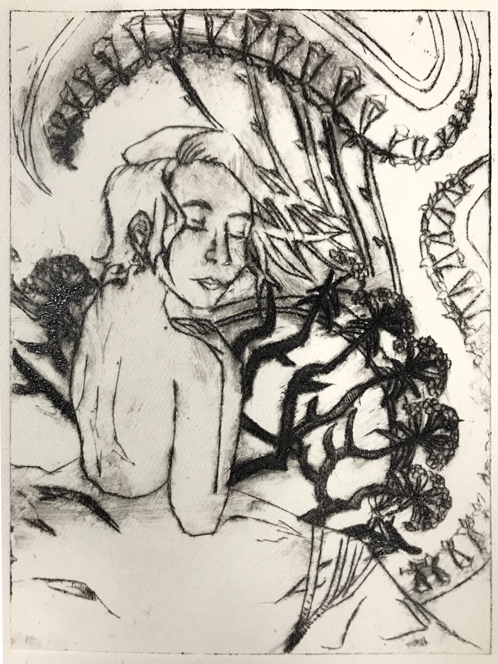
Dry Point
|
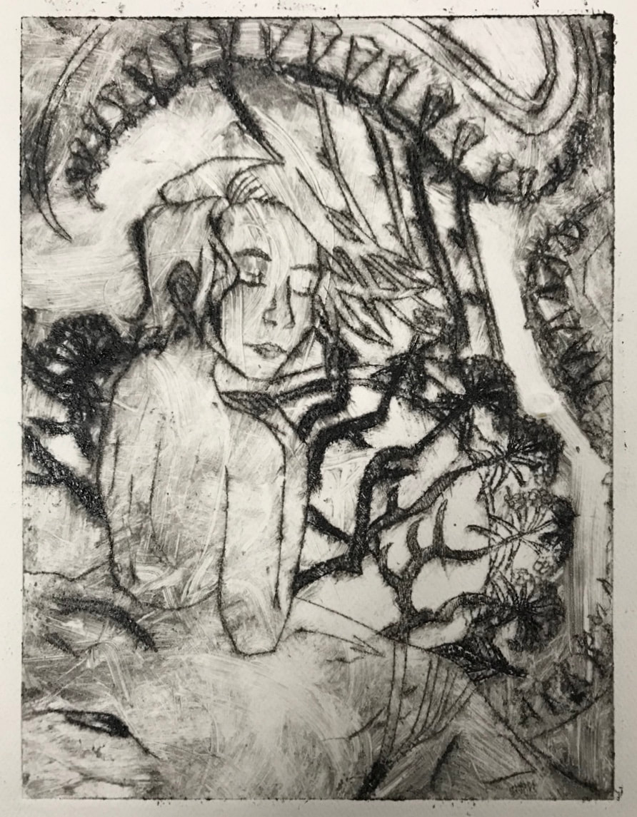
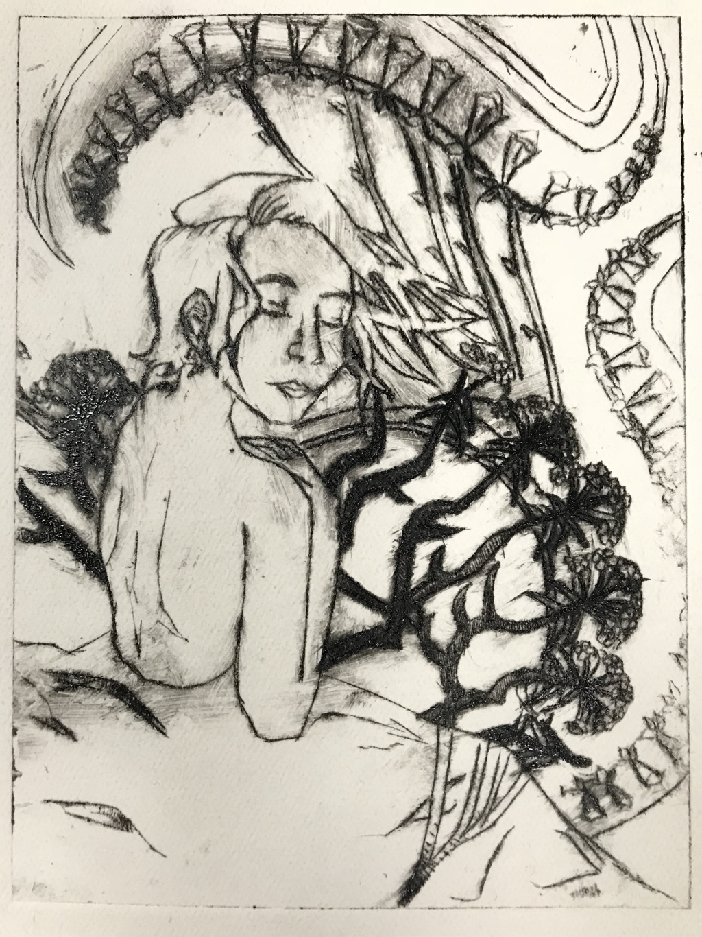
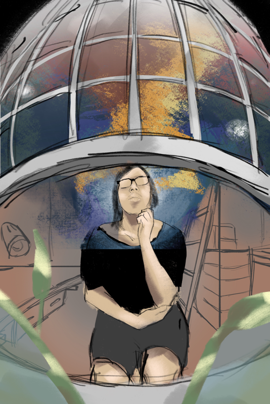
PensiveDrypoint Print
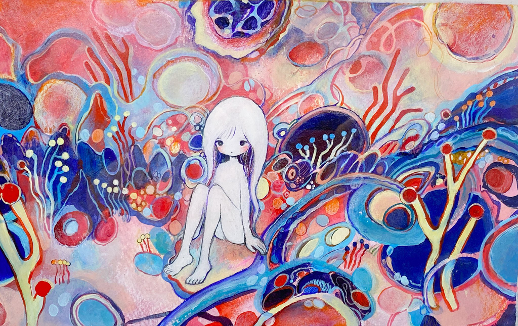
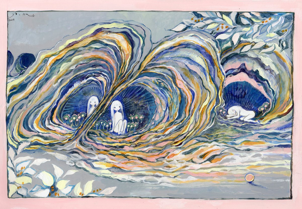
15cm x 20cm October 2019 Exhibition Text: Pensive was inspired by the Art Nouveau movement. Main inspirations include Alphonse Mucha's pieces such as F. Champenois Imprimeur-Editeur and Job. The intention of the piece is to express deep thought as it relates to emotional repression and stress. Mucha's pieces inspired me by the style, technique, and composition that was used while the theme and background of my piece is based off of my own ideas. |
Planning
Inspiration
|
My inspiration for my piece was soley based on Alphonse Mucha's works. I was intrigued by the amount of movement and repetition there was in his compositions. The main artworks i took away from for my piece was F. Champenois Imprimeur-Editeur and Fruit. The first piece used a lot of repeition in the floral design which I decided to use in my piece. Fruit had an interesting figural pose so that gave me an influence when I was planning out my piece. But what actually caught my attention to Art Nouveau in the first place was Job. I found it interesting how he broke current traditions at the time and how he conveyed erotic emotions through color, pattern, and shape. The purple contrasting with the green and beige creates a sensual feeling while the shape of the triange-patterned frame which was inspired by Byzantine mosaics gives it more movement. The use of line is very bold and contoured the patterns and hair intricately which I found the most intriguing. This unique style is what flickered a new idea of advertising products on posters. During this time period, many posters used bold colors and large text without any illustrations. The final piece that I took inspiration from was Monaco Monte Carlo by Mucha. This piece gave me the inspiration for the flowing background and how it interacts with the person. To me, this type of decoration on this particular piece evoked a hectic and chaotic feeling.
|
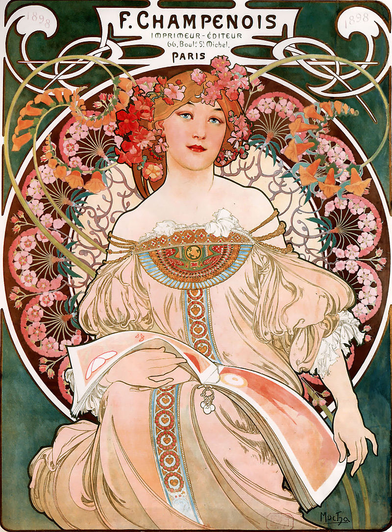
Alphonse Mucha, F. Champenois Imprimeur-Editeur. (Lithograph, 1898)
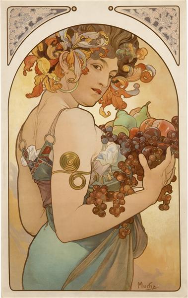
Alphonse Mucha, Fruit. (Lithograph, 1897)
|
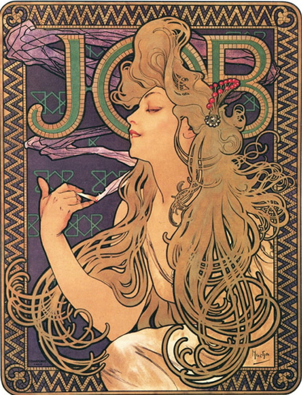
Alphonse Mucha, Job Cigarette Papers. (Lithograph, 1897)
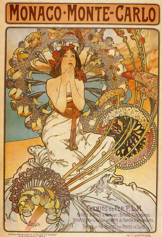
Alphonse Mucha, Monaco Monte Carlo. (Lithograph, 1897)
(Click on images to enlarge)
|
Alphonse Mucha's main reason for incorporating women into the majority of his works is because he wanted to add a feminity to the masculine, industrialized world he lived in. It was this contrast in tradition and normalities that made him a unique artist and eye-catcher for most people including companies. Many if his works at the time would be considered scandalous such as Job because "respectable" women of that time would never smoke in public. This inspired me to contrast beauty and feminity with serious thoughts of fear and anxiety.
Planning Sketches
|
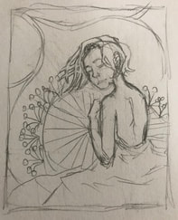
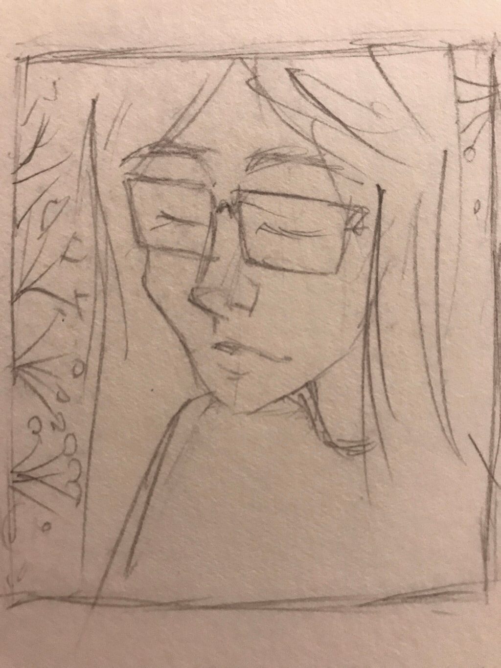
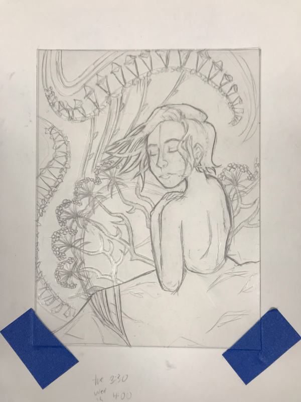
My first sketch ended up being the one that I chose for the final piece. It is inspired by Alphonse Mucha's use of line and the way he used flowers in his compositions. When I first sketched this, I was thinking about emotions, but once I was done I decided the theme should be about overthinking. Since this is just a really rough sketch, the final sketch and product ended up being more detailed in terms of the background.
|
|
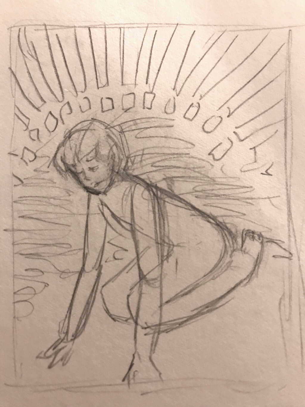
The second sketch is also inspired by Alphonse Mucha's works. It was going to relate to Mucha's use of line and movement. The composition of the subject is directly inspired by Cindy Sherman's Untitled #92. It relates to the way she uses camera angles to depict the symbolism of domination and submission. The background would have been inspired by Mucha's style but it doesn't really show in this sketch since I was still brainstorming.
|
|
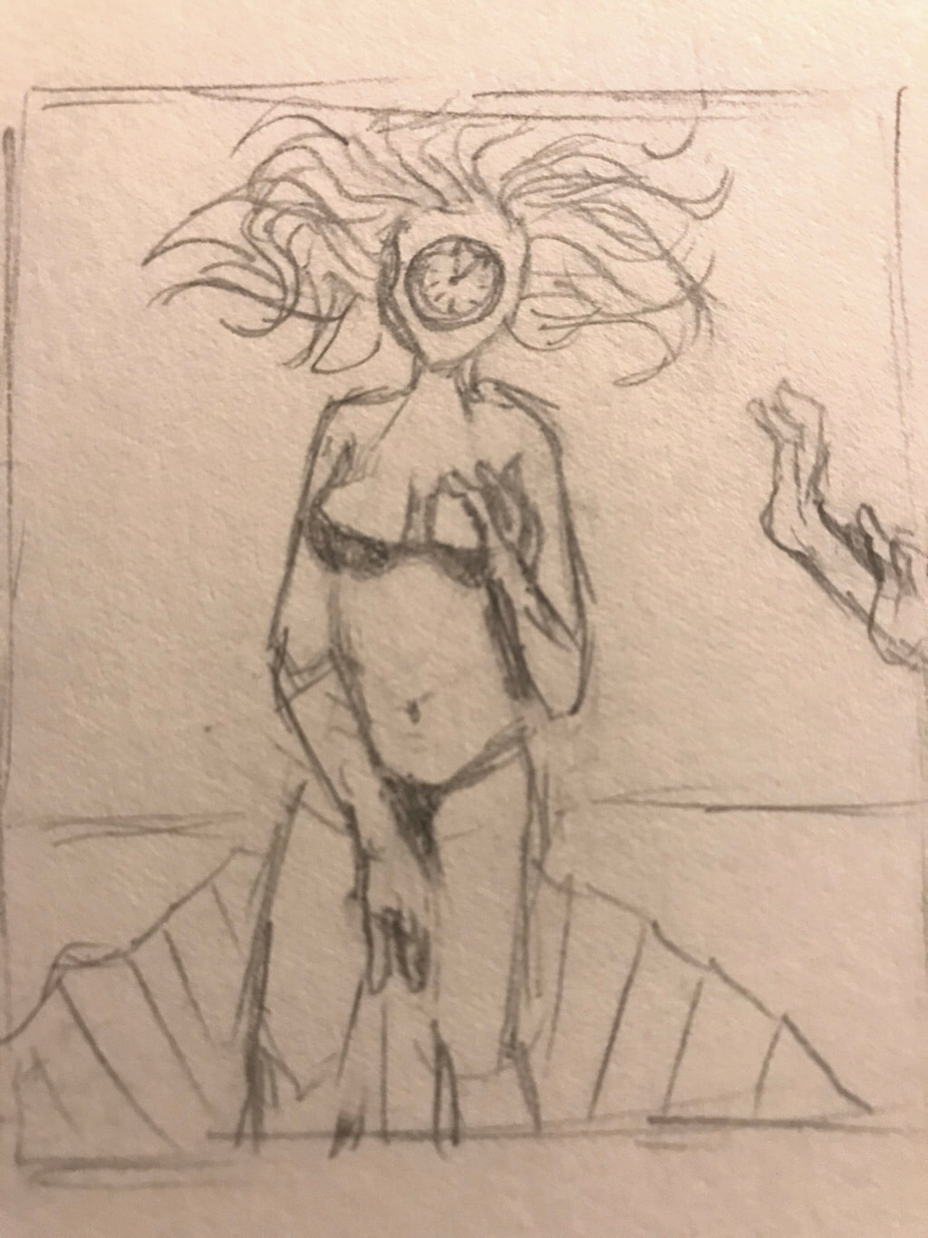
The third sketch is inspired by the Renaissance and surrealism movement. The main composition of the piece is inspired by Birth of Venus by Sandro Botticelli and Son of Man by René Magritte. It was going to include very intricate blending using a circular method for the engraving process. The clock in front of the face is supposed to relate to how Magritte put certain things in front of the subjects face. The theme of this sketch is gender.
|
|
The fourth sketch is inspired by Kehinde Wiley's works. Though the sketch isn't realistic like his works, if I were to follow through the final sketch would be a lot more refined. There wasn't really a theme that came to mind when I sketched this out but the technique and style would have related to his pieces in terms of the floral background and realistic style.
|
Process
ExperimentationOn the first attempt I was a bit hesitant since it was my first time doing a dry point print. As you can see to the right, there is a lot of ink residue left on the paper from the plastic plate. It was really difficult getting the ink off the small details without taking it off completely. The result of this print was not satisfactory because it doesn't really connect with the clean rendering of color and line that classic art nouveau has. Most of my mistakes could have been resolved if I new how much caution and time needed to go into the ink-wiping process. Also, when I needed to soak the watercolor paper into the water, I could have let it soak in for less time or maybe let it dry for a longer time. Next time, I'm going to take more time cleaning up the plate, being careful when rubbing ink off around the intricate details, and letting the paper become more dry before printing.
|
|
|
My second attempt ran more smoothly because since I knew that this process would take as much caution and patience as the engraving process took. I didn't make any changes to the engravement since I didn't see anything wrong or any plastic feathering out of the plate. I ended up taking a good five to ten minutes to wipe off all of the excess ink. The end result definitely ended up better than the first print. The second print has more clean lines than the first as well as a closer connection to the original art nouveau style. I would have to say that the intricate details such as the flowers closest to the woman in the drawing could use less ink. Overall, the end result of this print was mostly what I was trying to strive for, but now I have a better idea of what to expect the next time I make a dry point print.
|
|
|
(Click images to enlarge)
|
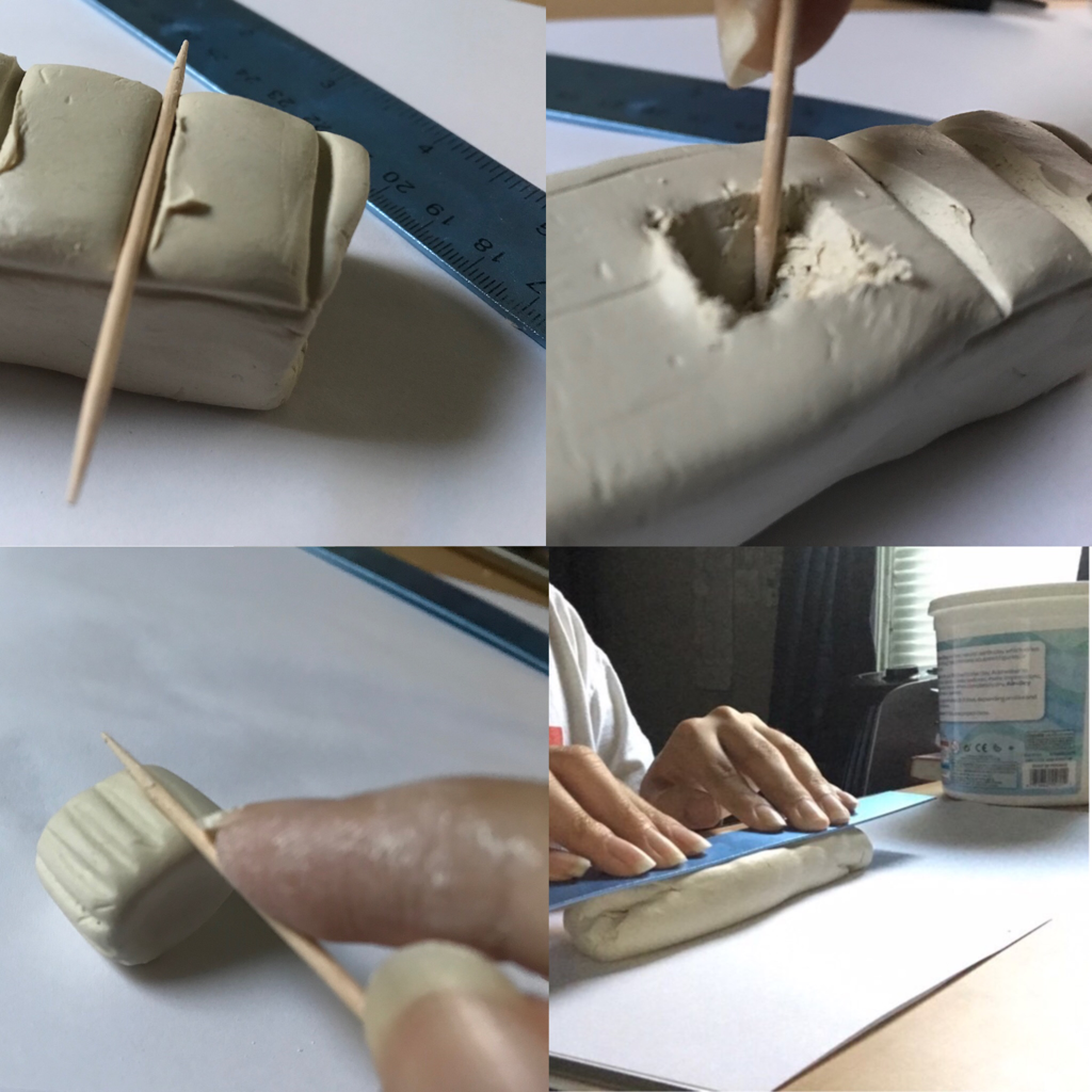
Process When I finished the planning sketches and figured out which one to follow through with, I started completing the final drawing. I started by drawing a rectangle with the same margins as the plate which is 15cm x 20cm. This is so after I'm done with the final drawing, I can engrave over it in the same size without any issues. The final drawing included all of the main details, but I didn't draw some of the shading details like some of the shadows or lighting because I figured I can deal with that once I'm done. Afterwards, I put the plate over the drawing and taped it to all four edges, which brings me to explain the next step; engravement.
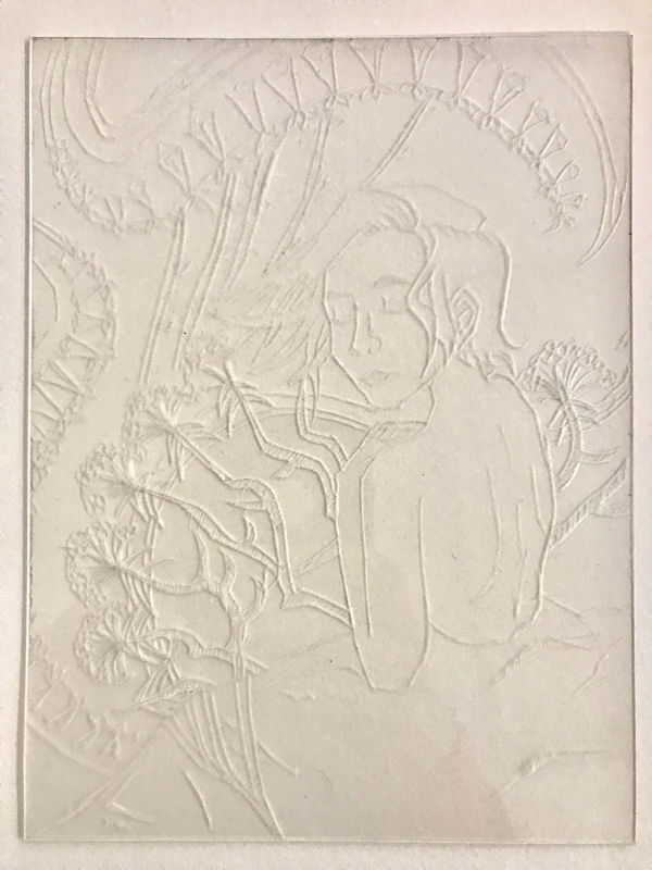
The engravement process was very difficult to grow accustomed to, personally. The dry point tool isn't really built to create curved or flowing lines, which was hard to deal with when carving out my print since that is a major part of the art nouveau style. This was the major learning curve of the experience overall personally. During the lengthy process I did learn certain techniques for making smooth lines which determined the way the point was facing, how I was holding it, and how much pressure I was applying. |
|
Since there are a lot of solid color and hatching involved in art nouveau pieces, I did keep that in mind when I started to engrave. I felt that there should be a hazy and murky feeling to the piece so I didn't want to include a lot of bold contrasts in terms of the background and foreground. So, I added dense hatching to the stems of the flowers and looser hatches to the clothes and hair. The next step was the printing process.
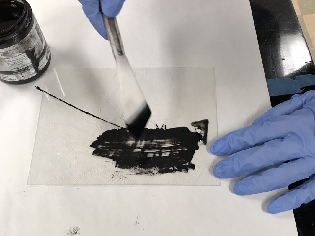
First, I used a palette knife to get around 1 teaspoon of ink onto the plate and then I spread it out using a flexible piece of material. For a dry point print, you only need a little bit of ink because the amount of ink that's needed is the engravements. Afterwards I used a folded piece of paper to rub off the excess ink. This process is a bit tedious but it's important to have a clean plate so that the print comes out without any blotches or unwanted ink residue. Once I wiped the plate, I started to print. For the print, I laid the print face up on the printing press and placed the damp watercolor paper on top. Then, I started rolling the printing press until the print got to the other side. The first print wasn't the best, so I ended up having to do a second one. |
(Click images to enlarge)
|
Reflection
To evaluate the process as a whole, it was very difficult and wasn't the kind of printng I'm used to. Getting smooth lines on the plate was very hard and time-consuming, and since there has to be a lot of pressure involved when etching it is easy to make a mistake. There were many struggles when it came to creating small designs such as the flowers next to the woman. Many of the flowers ended up looking geometric and less organic than I would've liked them but it translated better onto the paper than I thought. I learned that it takes a steady hand to make curved lines because I always had to readjust the direction I was holding the tool at to change the direction it would engrave. Overall, I think the experience of seeing the end result was very enjoyable.
|
|
Similarities- Bold use of line for contouring/outlining.
- Has movement as it relates to the decor of the art nouveau style. (Ex. flowing hair and circular-patterned floral designs.) -Both have unity which is what is the target for most of Mucha's pieces since they're made for advertisements. Differences-Both mediums are different. Mucha's works are lithographs while mine is a drypoint print.
-Mucha's lithographs have color while mine doesn't. -My piece has rougher texture and Mucha's works have a more smooth render. |
|
ACT Responses
Clearly explain how you are able to identify the cause-effect relationship between your inspiration and its effect on your artwork?
The artworks Job and Fruit by Alphonse Mucha caught my interest into creating an art nouveau inspired piece.
The artworks Job and Fruit by Alphonse Mucha caught my interest into creating an art nouveau inspired piece.
What is the overall approach the author has regarding the topic of your inspiration?
The author that described Alphonse Mucha's intentions for his artwork stated that Mucha intially started created artworks for commercial use but then later realized he should start making personal art pieces.
The author that described Alphonse Mucha's intentions for his artwork stated that Mucha intially started created artworks for commercial use but then later realized he should start making personal art pieces.
What kind of generalizations and conclusions have you discovered about people, ideas, culture, etc, while you researched your inspiration?
I discovered that many people have an interest in incorporating art and illustration as a marketing tactic for their company and that it is not uncommon, even in the 19th century.
I discovered that many people have an interest in incorporating art and illustration as a marketing tactic for their company and that it is not uncommon, even in the 19th century.
What is the central idea or theme around your inspirational research?
The theme for my piece is "deep thought" as it relates to anxiety. I wanted to research an art style that required a lot of detail but wasn't exactly realism, I felt that art nouveau was the perfect fit since it evokes an almost abstract tone.
The theme for my piece is "deep thought" as it relates to anxiety. I wanted to research an art style that required a lot of detail but wasn't exactly realism, I felt that art nouveau was the perfect fit since it evokes an almost abstract tone.
What kind of inferences (conclusons reached on the basis of evidence and reasoning) did you make while reading your research?
I feel that Alphonse Mucha feels that art is better off being expressed personally rather than putting it out there for commercial use.
I feel that Alphonse Mucha feels that art is better off being expressed personally rather than putting it out there for commercial use.
Bibliography
Alphonse Mucha: Inspirations of Art Nouveau, National Czech & Slovak Museum & Library, 2012. https://www.ncsml.org/exhibit/alphonse-mucha-inspirations-of-art-nouveau/
